On behalf of UCB (www.ucb.com), we have been developing two features for Atlas – new cohort sampling function and an extended patient profile view. After finalizing and testing these features, UCB wants us to share this back to the main Atlas and WebAPI repository. Before making a pull request, we want to give some background behind the features. Any feedback is welcome, as well as a discussion on how this could be best integrated into an upcoming Atlas release. Also, @fgiesen and myself will be presenting these new features in a software demonstration as part of the collaborator showcase of the upcoming 2020 OHDSI symposium.
Cohort sampling
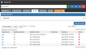
For inspecting a cohort it is sometimes useful to explore a sample of included patients from a generated cohort, therefore informing cohort design. Currently this is possible, but hidden away under the Reporting tab (Tornado->Sample Profiles). In addition, the samples are not persisted which could complicate the discussion of specific cases.
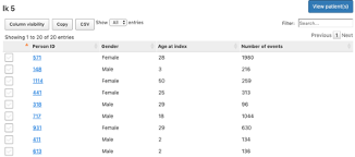
We added a ‘Samples’ tab in the Cohort page where you can create samples of any size for a selected data source, optionally refined based on gender and age criteria. Clicking on the generated sample will show the list of patient ids included in this sample, with gender, age and number of events. Each individual included in the sample can then be further explored using the patient profile link.
Generated samples remain persistent until a new cohort has been created for this data source, allowing cohort sample investigation to occur collaboratively and/or allowing reinvestigation later in time.
Patient Profile
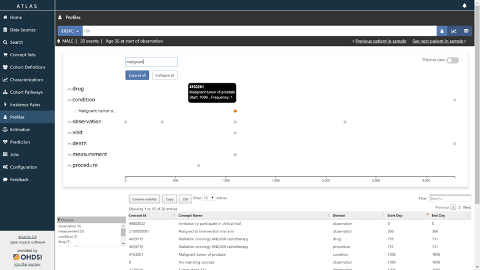
The patient profile tab has been reworked to enable a user friendly exploration of a patient pathway in a more targeted way. Some new features compared to the current profile:
- Each event is now displayed on a separate line. By default, the timeline concatenates all events from a domain on one line. Upon expanding a domain, every unique concept is displayed on a separate line. E.g. in the screenshot below the occurrences of ‘Malignant tumor…’ are shown.
- Concepts (a particular drug/condition/observation/…) can be pinned/unpinned to create a focused view of the patient timeline. Therefore, investigator can create a custom view of most relevant events, easing its interpretation of the events.
- For the purpose of cohort exploration, we have developed a possibility to display up to 10 patients on a similar view (stacked one below the other). Therefore, investigator could easily compare multiple patient timelines inside a data source/cohort. This feature, combined with the concept pinning one, allows a deep exploration and comparison of patients inside a cohort.
- The time unit can be toggled between relative and absolute dates. This feature shows its utility when relating to external events that may influence patient care pathway, where actual date informs investigator.
Please let us know whether you have comments on the features itself and/or on the integration into the main Atlas and WebAPI repositories.