Hello all,
I am doing cohort pathways analysis at two institutions.
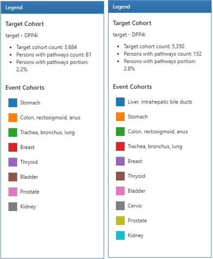
As you can see in the attached image, if the number of event cohorts is “0”, it is omitted from the legend, so the legends of the two institutions are different. Therefore, it is difficult to compare and analyze only with the color of the sunburst chart.
Is there a way to set the color of each event cohort in Atlas?
If that is not possible, can I download the result data of the cohort pathways and draw a sunburst chart in Python or R?
The version of Atlas I am currently using is 2.7.6.
There isn’t a way to specify colors in the design. It may be that you’re using an order WebAPI but I seem to recall that we changed the rendering of the sunbursts to create the legend (and assign colors) based on the design and not the output.
Based on the 2.7.6 codebase (thank you for sharing the version):
Note it’s bulding the colorScheme based on the event codes in the results.
However in version 2.8.0 it is defining the colors based on the event cohorts in the design (see here).
So, you if you can update to v2.8.0, that will synchronize the colors in the legend across all data sources. Or, if you want to grab the /js/pages/pathways/components/tabs/pathway-results.js file from the 2.8.0 release and just replace it with your local version, that may also work, but I don’t recommend that as working with one-off versions could lead to other issues. You’ll have to experiment in your own local environment for what makes sense.