I have carried out estimation and got the KM curve and curious about the reason why
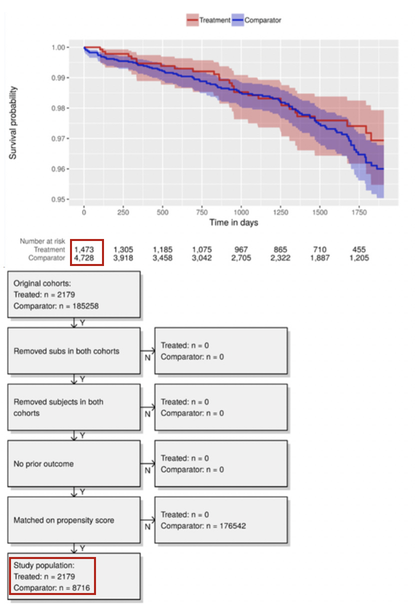
the number of treatment and comparator for Number at Risk is different to study population(treated, comparator) in attrition diagram when t=0.
Can some one please help me out with this?
Please find attached image to help your understanding.
Hi @hcho, not exactly sure what you’re question is – are you concerned about the number of patients left in the comparison group after propensity score matching?
My name is Song, working with Hyeyeon at EvidNet in Korea.
Sorry to cut in but I think what Hyeyeon is asking is why there is a difference between the study population shown in the attrition diagram and in the Kaplan-Meier curve at t = 0 (boxed in red respectively).
From our experience, there are cases where these two figures match but in some cases such as in the above example, the figures do not match. We were wondering what causes this difference.