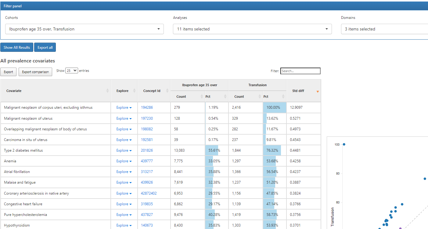
With Atlas 2.12 due out soon, we are gearing up for Atlas 2.13! One new enhancement idea I’d like to discuss here is to leverage the DataTable’s library’s proportional shading feature in the Characterization results’ percent fields, so that we can provide a visual element to the prevalence results tables, increasing clarity about which covariates are most prevalent, especially given the large set of covariates possible in each table.
Hmm, I use dark mode on MacOS, I don’t have the actual Atlas website showing as dark, just the standard white background. Does your browser render it differently?
Yeah, there’s actually function in Chrome to force websites to use Dark mode even if they don’t naturally render in dark. (Lifesaver for us with easy to fatigue eyes.)
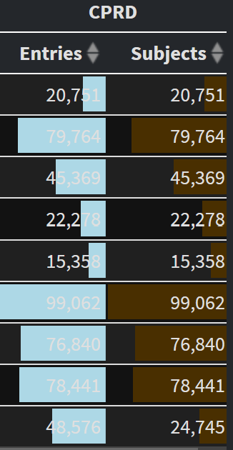
For context, CohortDiagnostics regularly looks like this:
I don’t expect this to be fixed or anything but since you’re inquiring about the functionality of proportional shading, this is what it may look like in that tool as well. I’ve learned to work around it.
Just something for us to think about as we get more sophisticated in our tooling.