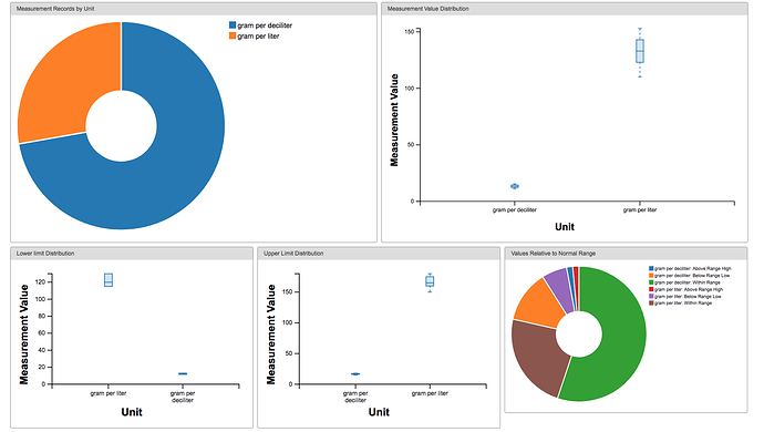
Achilles gives great visualisations for the measurement values in the measurement concept detail panel. Both for the actual values (per unit) as the ranges. I could not find a good example on the public Achilles, so here is a screenshot of the details I am referring to:
However, there is no distribution of value_as_concept_id . Besides for measurements, this would also be very insightful for observations (at least to check that the value_as_concept_id is indeed an affirmative ‘yes’).
My proposal is to create a pie chart for the distribution of value_as_concept_id. First, the Achilles R package needs to be extended with functionality to create these aggregates (counts). Then the json export and/or webapi need to be adapted. Lastly, the user interface needs to display this data in a chart.
Are there people with similar ideas or have even started with such an integration?
And is AchillesWeb still maintained, or do all new integrations have to be in Atlas/Data sources?
Is there potentially a use case to integrate this with new Achilles Heel checks?
Comments and feedback are greatly appreciated!


