Thanks to those who were able to join today’s OHDSI community call, where I shared the results of my February health data story. For those who missed it, the recording is here and the slides were posted here.
As a summary to convince you to watch the recording:
I was motivated this month by one of the highlighted ‘Heart Disease Research’ profiles that suggested “insomnia may significantly raise stroke risk”. The summary was, in part, based on a publication in Stroke that explored the association in an administrative claims database from Taiwan. The authors used a case-cohort design, where patients in insomnia were age/gender-matched to a comparator cohort, and a time-to-event analysis using a Cox proportional hazards model was used to estimate the effect of insomnia.
I struggled to think through this methodological design choice and whether that was finding an association or attempting to elucidate a true causal effect. As discussed in my January post, there is a recurring theme around “what really IS a ‘risk factor’?” that I still haven’t gotten my head around completely. My concern with the case-cohort approach was that patients with insomnia and patients without insomnia can be very different on a lot of different dimensions, and matching on age/gender and adjustment for a handful of baseline covariates may not be sufficient to construct a comparison where insomnia status is the only meaningful difference to explain the future risk of stroke.
I thought an alternative design may be to try to create a comparable population at baseline who does not have insomnia or stroke, then use a period of time to classify ‘exposure’ status based on insomnia onset (or not), and then use a period of ‘time-at-risk’ that follows the exposure period to ascertain the stroke outcomes. In a schematic, it would look like this:
So, how can the OHDSI tools help us design and implement this analysis? It was as easy as 1-2-3-4!
Well, step 1: I created the three cohorts in my local instance of ATLAS. (to share all my work, I exported these cohort definitions from my local environment and imported them into the ATLAS instance available on ohdsi.org, so the links below are accessible to everyone, you’ll find them all just be searching ‘feb health story’).
Target: [Feb Health Story] Visits with no prior insomnia or stroke with insomnia onset in 365d post-visit (T) (http://www.ohdsi.org/web/atlas/#/cohortdefinition/1732382)
Comparator: [Feb Health Story] Visits with no prior insomnia or stroke with no insomnia onset in 365d post-visit (C) (http://www.ohdsi.org/web/atlas/#/cohortdefinition/1732384)
Outcome: [Feb Health Story] Incident Stroke (O) (http://www.ohdsi.org/web/atlas/#/cohortdefinition/1732383)
I generated the cohorts across my local databases. I was impressed to see in one large administrative claims database, there were almost 10,000 patients in T, more than 6 million in C, and >300,000 in O. So sample size wasn’t going to be our problem…
Step 2: I used the ‘Incidence Rate’ tool in ATLAS to examine the rate of outcomes in my ‘exposure’ cohorts (http://www.ohdsi.org/web/atlas/#/iranalysis/1732385). I also stratified the risk by age groups and insomnia status to see if I could pick up a crude increased risk associated with insomnia, as was reported in the Wu et al. paper. Here, I saw a few cool things:
First, from the table, I could see, as we would expect, that the risk of stroke increases with age. I could also see that the incidence rate in the strata ‘with insomnia’ was 1.90 per 1000 person-years, whereas the overall incidence rate was 1.29, so there is a crude association being observed. Here, the nifty treemap on the right-hand side was quite helpful, because that shows the size (the area of the box) and rates (the color) for all strata. So, we have 4 mutually-exclusive age groups (18-34, 35-49, 50-64, 65+) * 2 insomnia strata (‘has insomnia in 365d post-visit’ vs. ‘does not have insomnia 365d post visit’ = 8 possible strata…in this database, we didn’t have any patients over 65, so that left us with 6 strata. The biggest boxes are the strata without insomnia, the narrow rectangles on the lefthand side of the treemap are those age groups with insomnia. And what we saw was, consistent across all age groups, the population with insomnia had a higher 1-year rate of events than the population without insomnia. So in one tool, we are able to see the crude, unadjusted effect, but also see that the effect holds when fully blocking on age by looking at the strata-specific risks. Very fun! I hadn’t ever used the tool to do this before, but now that I have, I can see a lot of other opportunities for a similar approach in the future.
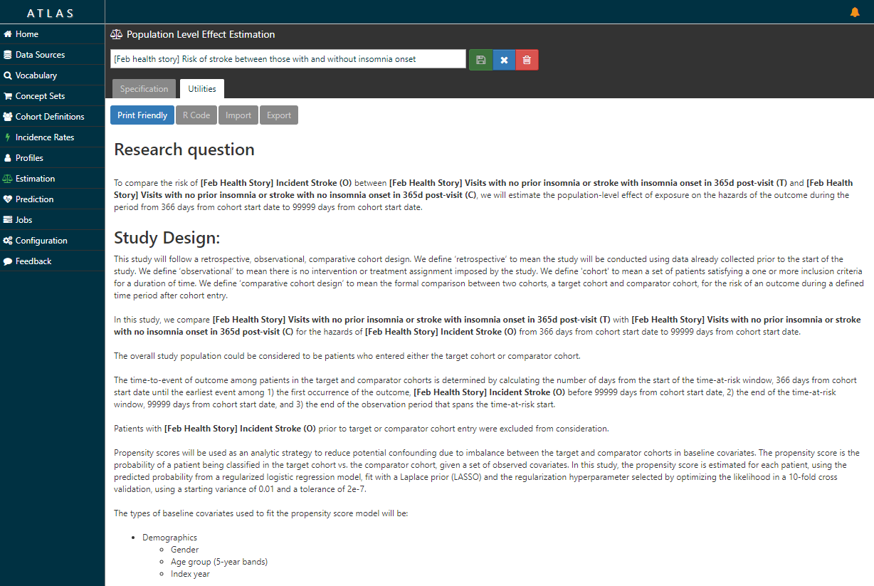
Step 3: I designed a comparative cohort analysis in the ‘Estimation’ tab of ATLAS (http://www.ohdsi.org/web/atlas/#/estimation/1732386).
This study follows our current standard framework. Select your T, select your C, select your O. Pick a model (here, Cox proportional hazards for a time-to-event analysis to estimate a hazards ratio). Pick a time-at-risk : here, we have to use a risk period to start 366 days after the visit (because day 1 through day 365 was used to classify insomnia status) until the end of continuous observation. How do we make T and C comparable? One strategy is propensity score adjustment. Typically, we think about propensity score as a probability of treatment assignment, but more generally, it is the probability of being ‘assigned’ to the target cohort vs. the comparator cohort. In our case, the probability of having insomnia onset in the 365d after the visit vs. not having insomnia during that time. We can use all baseline covariates PRIOR to the visit (demographics, conditions, procedures, drugs, measurements, etc.) but we SHOULD NOT use observations observed during the 365d ‘exposure status’ window AFTER the visit, because those could be causal intermediaries (because you wouldn’t know if a covariate occurs before or after the insomnia onset or not). Once I laid it out in this way, it helped me see the concern in the case-cohort design approach more clearly.
Now, the ATLAS ‘Estimation’ tab doesn’t just lay out the litany of analytic design considerations in a comparative cohort design. Take a look at the ‘Utilities’ button after you review the Specification …it writes the protocol for you…
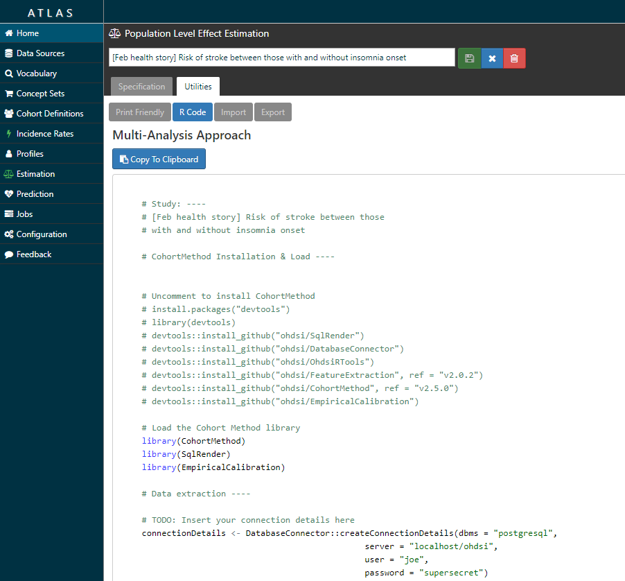
…and it also writes the R script you need to execute to fully implement your design against your data.
(Technical note, I was using ATLAS/WebAPI 2.3 for this work, which was just released this week and should be deployed onto ohdsi.org in the next couple weeks. Release notes here and here. Thanks to @anthonysena, @Chris_Knoll, @Frank, @pavgra, @chen_regen, @lee_evans, @schuemie and others for all your hard work on this…the latest version of ATLAS is really awesome, I strongly encourage all of you to upgrade to it in your local environment ASAP! In particular, the ‘Estimation’ tab looks a bit different and the R code that is generated is cleaner.)
Step 4: I executed the R script that ATLAS provided in my own environment. What ATLAS is really doing is connecting together all of the amazing tools within the OHDSI methods library (thanks @schuemie and @msuchard!!!) into one script that walks you step-by-step through the analysis execution process, including cohort construction, feature extraction, model fitting, and results reporting. The script makes use of several R packages developed within the OHDSI community, including: DatabaseConnector, SqlRender, FeatureExtraction, CohortMethod, and EmpiricalCalibration. Some of these packages are available in R via CRAN, the rest can be installed via GitHub using the R devtools package.
Quite literally, the only code I had to change was the part in the top part of the template:
# TODO: Insert your connection details here
    connectionDetails <- DatabaseConnector::createConnectionDetails(dbms = "postgresql",
                                                 server = "localhost/ohdsi",
                                                 user = "joe",
                                                 password = "supersecret")
    cdmDatabaseSchema <- "my_cdm_data"
    resultsDatabaseSchema <- "my_results"
    exposureTable <- "exposure_table"
    outcomeTable <- "outcome_table"
    cdmVersion <- "5"
    outputFolder <- "<insert your directory here>"
So, what did I find?
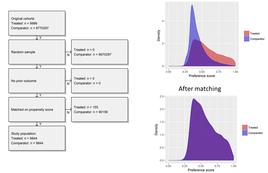
First, I was able to start with very large cohorts in a database but sample up to 100,000 in T and C to make a dataset that was quite small and would run extremely efficiently, even when just running on my laptop. Second, I could examine the propensity distribution to see how comparable the people were who developed insomnia vs. those who did not. What we see was interesting to me, the people who develop insomnia have span a fairly wide array of the preference score space, while the people who do not develop insomnia are most homogeneous in their predicted risk. While there was a reasonable overlap of patients between the two groups, its quite clear that most people without insomnia do not look anything like those with insomnia. Once we applied 1-to-1 propensity score matching, we see complete overlap in a distribution reflective of the insomnia cohort.
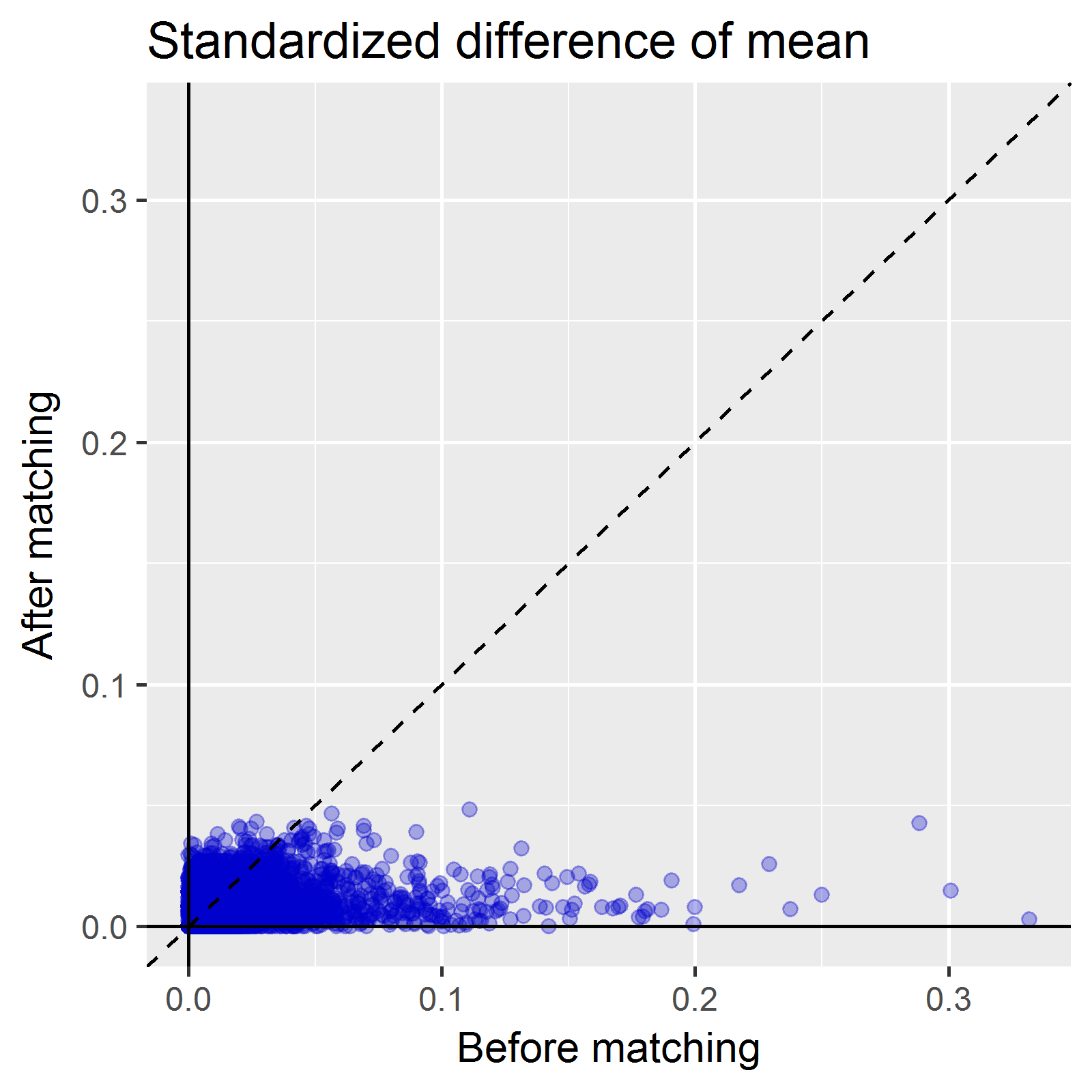
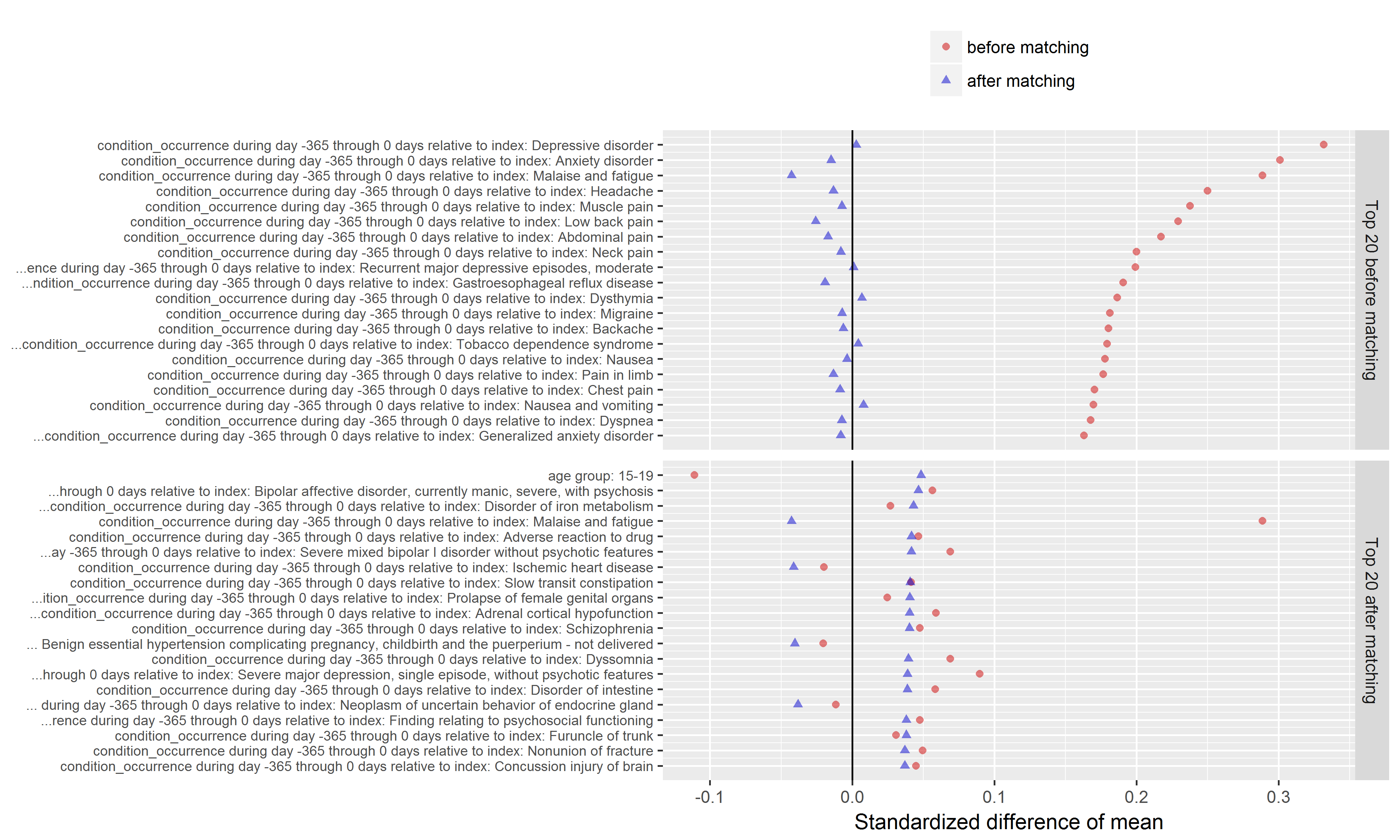
Another important diagnostic that comes out of the CohortMethod package is the covariate balance plot. This shows the standardized difference of the covariate means of all baseline covariates (each represented by blue dot) before matching (on X axis) and after matching (on Y axis). A general rule-of-thumb is a standardized difference > 0.1 represents imbalance that could be a source of potential bias. So, the way I read the graph below: first, I inspect the x-axis to see how many covariates were imbalanced prior to matching, and also to see the magnitude of the difference. Here we can see there is a good number of variables with SD>0.1 before matching with a max > 0.3. So that tells us that indeed, patients who develop insomnia are different from those who do not develop insomnia, and those systematic differences could also be potential causes for observing onset of stroke is not adequately adjusted for. The second thing I look for on this plot is to see how well propensity score matching worked in achieving balance. I was actually quite impressed here that, with ~10,000 matched pairs, we are able to achieve good balance across all baseline covariates, SD<0.1.
Another valuable plot generated in the CohortMethod package shows the top imbalanced covariates before and after matching. As you can see below, the top conditions we see imbalanced between those who do and do not develop insomnia include various comorbid conditions that you’d probably immediately think of when thinking about sleep disturbance, such as depression, anxiety, pain, headache, and nausea. What’s interesting to note though, while Wu et al. did adjust for depression/anxiety in their multivariate model, they had not included any covariates around pain, headache, or nausea. As @hripcsa rightfully pointed out on the call, if we are thinking about this in a framework of causality, we need to be particularly careful about the temporal sequence of events: what if a person can’t sleep because they have headaches, and those headaches are really just a symptom of cerebral occlusion that only later after many days of sleepless nights results in an infarct that sends the patient to the hospital for stroke. Now, even with the design I’ve outlined here, we cannot rule of some unobserved activity that could be the causal precursor to both insomnia and stroke. But at least for those factors that are observable, we can and should try our best to make sure we balance on these factors, and large-scale regularized regression is a nice way to learn a model that will make use of as much information as possible.
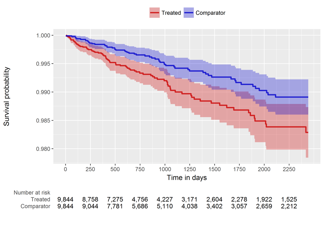
So, our comparative cohort analysis diagnostics check out, it’s time to look at the population-level effect. Since we’re doing a time-to-event analysis, we can look visually at the contour of risk using a Kaplan-Meier plot (below). And we can also summarize the risk with a hazard ratio and associated confidence interval: HR = 1.68 (95% CI: 1.10 - 2.59). It turns out this estimate is generally concordant with the Wu study, so maybe in this instead my concerns about the case-cohort design weren’t as justified as I thought. But, even still, if we want to make any causal claims about ‘risk factors’, I would feel much more comfortable doing so by using a structured design that follows the best practices advocated by our OHDSI population level effect estimation workgroup.
Items I would have liked to explore further for this month, had I not run out of time (curse you February for being only 28 days!!!):
-
use of negative control outcomes - thanks to @ericaVoss we have a nice process using the LAERTES/Common Evidence Model to produce a list of candidate negative controls when we are interested in studying drug-outcome effects using product labeling, published literature, and spontaneous reports, but it’s less obvious to me how to conceptualize the idea of negative control outcomes when we are studying the risk of one condition on another. Without a list of negative control outcomes, I couldn’t do empirical calibration, even though I do believe that should be a required best practice that we should all follow when completing a legitimate population-level effect estimation study
-
I used 1-to-1 matching. In many other studies I’m doing for work, we’ve been favoring variable-ratio matching because of the adding precision it offers, and in one recent study we’ve used stratification because we could achieve balance and we really wanted to preserve the full sample size. I wondered what, if any, impact that would have on this study.
-
It would have been interesting to see if the results held up when executing the analysis on other databases…perhaps others in the community would like to follow this step-by-step activity and run on your own data and share what you find?
Anyway, that’s all I got for February. Thanks to the American Heart Association for raising awareness of the importance of heart disease research, and for showcasing observational database research as part of their efforts. I hope our OHDSI community can contribute to their cause, not just in the Februaries to come, but all year long, when we see opportunities for reliable evidence generated from our international data network may be appropriate to impact health decisions.