OHDSI Home | Forums | Wiki | Github

IR analysis grid overview

We have been developing a new view for the Incidence Rate (IR) Analysis. We would like to share this idea and get some input on whether someone else is working on a similar feature and how to integrate this in the existing OHDSI applications and workflow.

In the new view shows the results from an IR analysis in a grid like way, with target cohorts on the rows and outcomes on the columns. See the mock below:

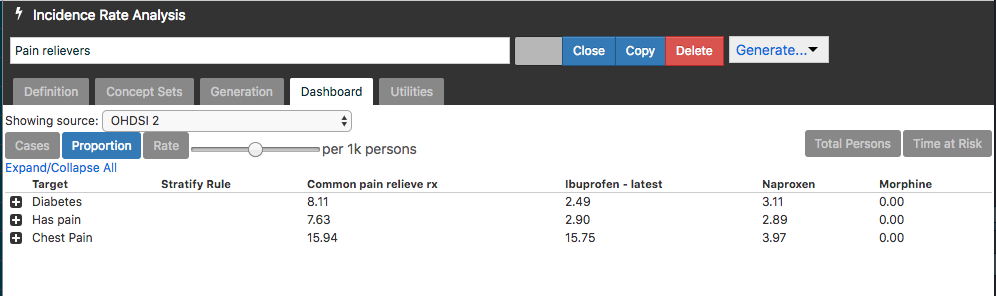
An example use case we want to cover is to show the number of patients treated with a user-selected medication by condition. Or incidence of certain procedures in different lines of treatment.

@Patrick_Ryan already commented that this grid-like view was omitted by design, as it gives the idea that you can compare between these unadjusted target cohorts. One should not draw any conclusions from this data. In addition, this view does not show all metrics (population, cases, proportion, TAR) that the generation tab does show.

Therefore, some restrictions should be applied to avoid bad practice. For example adding a warning message, restricting the view or restricting to drug exposures as outcomes (e.g. as extension of TxPath where only drug concepts are used).

Please comment whether you share this concern and how you would alleviate this problem.

1 Like

[Apparently, my reply didnā€™t ā€œtakeā€ through email, so am pasting it here:]

First time contributor to this list (and thread) ā€¦

Canā€™t comment on the specifics here (below), but have some longstanding experience with the general phenomenon.

Many times, in an inter-disciplinary project, I have created, or helped create, a representation of data - whether a table (as below), a graphical representation/visualization, or a project-specific data browser.

Initially, it is met with skepticism, criticism, or outright hostility, but over time it can become the cognitive model of whatever the data is describing. Canā€™t emphasize this enough - data representations can become a cognitive model for an inter-disciplinary group.

Thus, as much care as is practical should be spent on the creation of such representations as, once displayed to your colleagues, they may have consequences beyond anything intended.

And, of course, thatā€™s the good news. :slight_smile:

ā€” Mark

Mark Samuel Tuttle, FACMI
Orinda, California
925-899-3099 m.

Yes, that is exactly the concern. I like how you phrased it. Any specific view on our proposed data representation? Thanks!

I donā€™t know enough about the domain to comment usefully.

Just try to talk to as many colleagues as you can, individually at first, and learn from each, revising as you go.

Good luck.

ā€” Mark

@Patrick_Ryan We would like to move this forward and draft a PR.

Our current solution is to add a warning message, which has to be actively clicked away before you can view the grid (like the cookie collection message on most websites). Something like

ā€œThe following overview shows unadjusted metrics. Do NOT use the given proportion or time at risk to draw conclusions from the data. For a comparison between cohorts use the ā€˜Estimationā€™ tool.ā€

Will this be sufficient or do we need a redesign before this feature can be integrated into Atlas?

1 Like
t