OHDSI Home | Forums | Wiki | Github

Evaluation metrics

Copying @hripcsa’s post here:

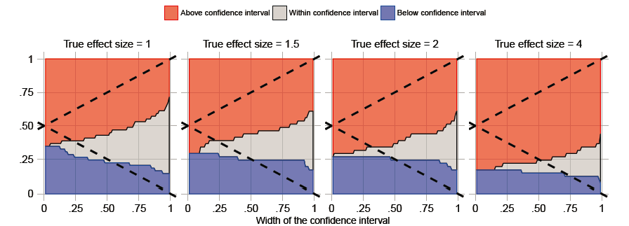
Just thinking further about metrics for assessing CIs.

If we are really interested in effect estimation, then want confidence intervals w.r.t. true value:

  • coverage

  • mean CI width

  • variance of CI width

  • bias (point estimate or CI midpoint versus true value)

  • see Kang and Schmeiser CI scatterplots [1] (e.g., CI half width versus midpoint)
    (they are much like Martijn’s scatter plots)

If we want to discover associations, then we want confidence intervals w.r.t. no effect (1), and the true value is irrelevant other than its direction:

  • this is really just a hypothesis test (p-value)

  • specificity is set at .95 (95% coverage of negative controls after calibration)

  • sensitivity is proportion of excluding no-effect (1) for positive controls
    can derive relation of sensitivity to CI: (CIwidth / 2) < EffectSize - 1

  • ROC area calculated based on point estimate of specificity and sensitivity
    (or perhaps could generate curve by altering alpha .2, .1, .05, .03, .01)

Just noticing that when we do p-value calibration and report coverage, we really should also report power on positive controls.

  1. Keebom Kang, Bruce Schmeiser, (1990) Graphical Methods for Evaluating and Comparing Confidence-Interval Procedures. Operations Research 38(3):546-553. http://dx.doi.org/10.1287/opre.38.3.546

George

Just adding the plot we recently developed for our confidence interval calibration paper:

I think I like these because they also focus on “centeredness” next to coverage.

I now have results on several methods on a single database. I’ve made a first attempt at outputting the results, of course using a Shiny app. (Note: most bold text provide hints if you mouse-over)

As was the case in OMOP the problem is that there are so many ways to slice and dice the data, even when we only have a small subset of the total number of analyses I’d like to include. Any thoughts on how to analyse and present these results is welcome!

@schuemie, this is really remarkable. Tremendous work! You are amazing.

  1. I actually like the dashboard. it wasn’t immediately obvious to me
    that all methods were in the table (because it was paginated) and it was
    only after I re-sorted on AUC that I found the surprise that
    self-controlled cohort method is still achieving strong performance. (I do
    see I could have clicked on which methods to show/hide, but that was out of
    sight without scrolling down on my screen, so I missed it initially).

  2. Could we make the table contain ALL data, so that it would be possible
    to show, for example, a calibrated vs. uncalibrated performance next to
    each other (if thats what the user wants to see).

  3. I support the notion that when we typically generate calibration plots,
    we don’t want to promote the behavior of people exploring the test cases
    that achieve statistical significance, and we definitely don’t want posthoc
    rationalization governing choices of negative controls in studies of
    unknown effects. I’m wrestling in this case how we want to expose the test
    cases…at the mininum, I would think we need to expose the list of
    drug-outcome pairs used in each experiment. what’s unclear is whether we
    want to further expose which test cases didn’t yield estimates or even
    further to expose the actual effect estimate, CI, case counts, etc. My
    immediate reaction is that showing everything will make it too easy to
    encourage posthoc rationalization that may lead us astray in inappropriate
    directions, but a part of me thinks that the posthoc rationalization may be
    appropriate in this context of methods evaluation if we see trends that
    either highlight limitations of a given method or identify testcases that
    are consistently challenging for all methods to allow further drilldown.

  4. Could we show the ROC plot, in addition to the calibration plot?
    Perhaps that may make it convenient to identify decision thresholds with
    acceptable sensitivity/specificity thresholds?

  5. The ‘True effect size’ dropdown didn’t seem to function on my end, but I
    like the idea of restricting on that.

  6. Could we add ‘number of estimates’ to the table so you know when you are
    looking at any performance measures, you can assess how precise the
    performance measure may be.

This is really great. Thank you for leading the community in this exciting
direction!

The “OHDSI Population-Level Estimation Method Evaluation” is very neat. (Despite the mouse-overs, I still need a little more what some columns mean. Can I get that somewhere?)

Really fantastic work Martijn. Are there plans to run a meta-analysis over
all of these results? It would be a useful way to summarize the findings
for publication take-aways.

Happy to participate in discussions about that and/or take the lead in
designing it. My feeling is that a multilevel bayesian model would be the
best way to understand the influence of parameters that only exist for
certain methods, etc.

On Mon, Sep 25, 2017 at 2:25 PM alejandro schuler <
alejandro.schuler@gmail.com> wrote:

@Patrick_Ryan: I’m not yet convinced of the need to show calibrated and uncalibrated metrics side-by-side (also because that would require an extra column and the table may no longer fit :wink: ).I did add mouse-overs for the scatter plots. I agree that despite the danger of post-hoc rationalization it can be helpful to know exactly which controls are problematic for a particular method. I also added the ROC plots, fixed the ‘True effect size’ dropdown, and added a line (above the metrics table) stating how many positive and negative controls were used when computing the metrics. This might be a good time to point out that the number of controls used is limited by things like the MDRR and stratum of choice. Some methods may not have estimates for all controls (expressed in the ‘Mis’ column) in which case those estimates are considered to be RR = 1.00 (95% CI: 0-Inf) when computing the various metrics.

@hripcsa: Here’s my attempt at explaining the columns a bit better:

  • Method: name of the method
  • ID: the analysis ID, identifying a unique combination of analysis choices for that method
  • AUC: Area Under the ROC Curve. If no specific true effect size is selected this is for classifying all positive controls vs. all negative controls. Else is it is for classifying positive controls with the specified true effect size against all negative controls.
  • Cov: Coverage of the 95% confidence interval.
  • MPr: Mean precision. Precision = 1/SE^2. Higher precision means narrower confidence intervals. If you want the best estimator of effect sizes, you probably want the method with 95% coverage and the highest MPr.
  • MSE: Mean Squared Error between effect size (point) estimate and the true effect size.
  • T1E: Type 1 Error: for all negative controls, how often was the null rejected (at alpha = 0.05)
  • T2E: Type 2 Error: for all positive controls (or the ones with the selected true effect size if specified), how often was the null not rejected (at alpha = 0.05).
  • Mis: Missing: for how many of the controls (mentioned in the line above the table) was the method unable to produce an estimate.

@aschuler: I hadn’t thought about how to further interpret these findings. Could you elaborate on your ideas further? I do want to extend the number of analyses per method, including more combinations of the same ingredients already tested here (e.g. an SCCS analysis with both correction for age + seasonality and including all other exposures). That would make it harder to interpret for mere mortals, but may help what I think you’d like to do.

1 Like

sorry i should have been clearer, i didnt literallt mean ‘sidebyside’ as
adjacent columns, but rather that all filter options on the lefthand side
should be ‘check all that apply’ instead of some being one choice
dropdowns, because there may be comparisons that we dont anticipate that
could be valuable (side by side means adjacent rows in this context).

really exciting stuff!

Sure, the basic idea is just to run a meta-analysis on the results you get.
So for each “outcome” (e.g. MSE, coverage, etc.) we could fit a model like:

MSE = f(method, method_parameters)

which would be a principled way to assess the magnitude of the effects of
using these different methods and settings. We can also get confidence
intervals on those effects themselves, allowing us to say under which
circumstances the choice of methods actually makes a practical or
statistical difference. The usual choice for f is a linear model, but in
this case we need to use multilevel models to capture the fact that
different methods sometimes have different parameters so it would look
something like:

MSE = mu_method + betaparams + error1
mu_method = alpha
method_params + error2

If we use a baysesian framework and fit with MCMC (off the shelf) we can
get full posterior inference on all of the parameters, meaning we can
easily put credible intervals on the answers to questions like: if you’re
using cohort method and matching, how much better do you do with a full
outcome model relative to a limited model?

Let me know if that makes sense. If you send me raw .csvs of the results I
can play around with them and see where it goes.

t